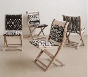
Why pattern is so important
Have you ever walked into a room that was so well designed and you thought “How in the heck did the designer think to put all this random stuff together and make it look so damn good???” Well its not magic (sort of) but it is a combination of pattern used correctly with scale and layering.
I get this question a lot from clients: “If I have too much pattern in a space, isn’t it going to look too busy and feel like there is too much going on?” and the answer is Hell No!! 😉 The truth is that a well curated space with a variety of pattern done in the right scale is the most beautiful and layered way to design a room. I often use the reference of a high end hotel. As a designer, I can’t help myself when I walk around a hotel or high end restaurant and I start touching all the walls and finishes. I’m sure people see me and think I am totally nuts. Those are some of the best places to see the way mixing pattern can make a place look amazing and so unique. I like to bring up the fact that luxury hotels could have 20-30 different finishes and materials in a space, and then clients realize that YES! in fact there are a bunch of finishes and patterns in those spaces. So when its done right it makes for amazing design. In my opinion its safe and easy to play it simple, but just like nature, there is pattern in everything. So please embrace the idea and when in doubt don’t shy away from using pattern.
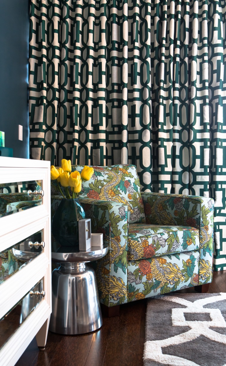
Why color is so important part 01
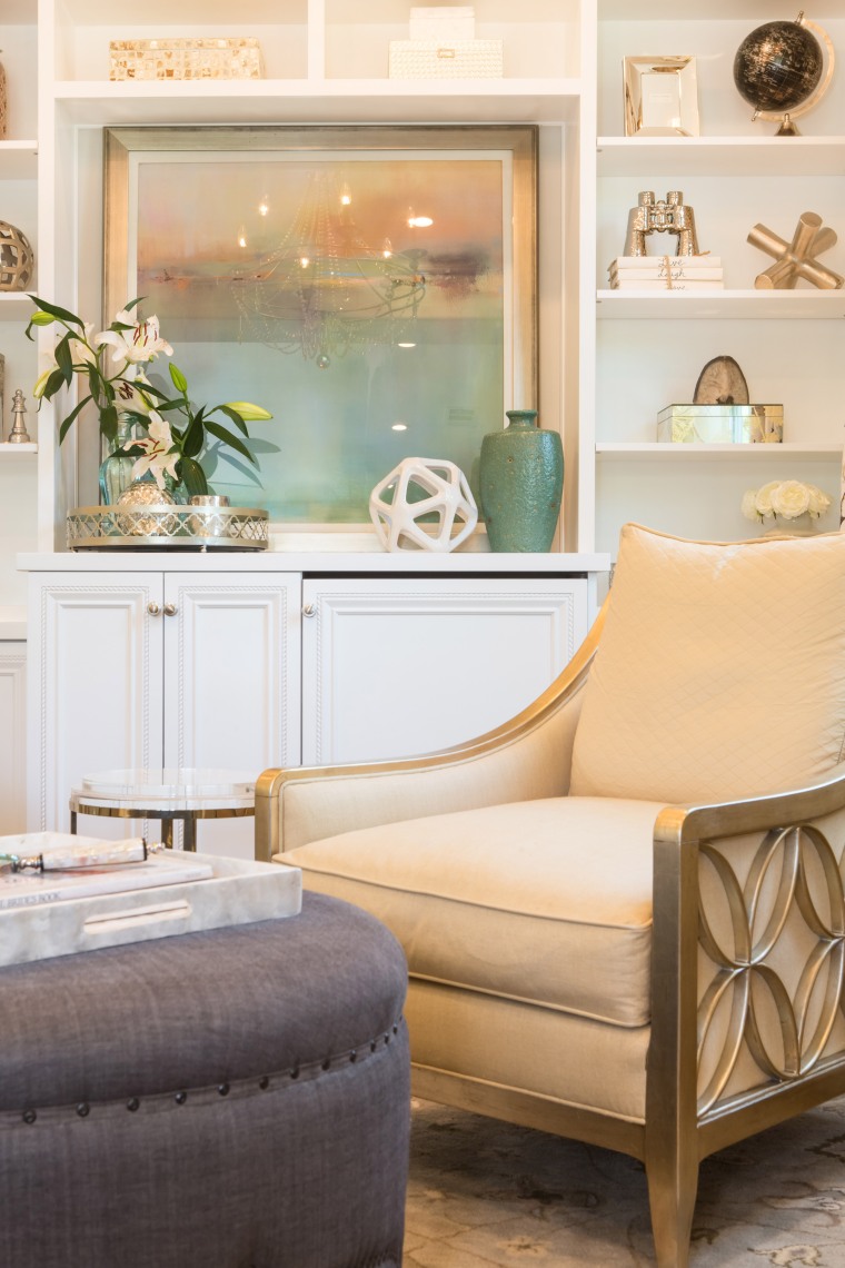
I’m going to have a little bit of a rant here because this is something that has affected the design community for a long time and I think as designers we are all secretly thinking the same thing but I don’t know that our clients understand how we feel about it. I’m talking about the lack of color in the marketplace that is being dished out to everyone! We deal with this all the time because on a weekly basis we get clients telling us “I love the Restoration Hardware look”. So I’m just going to put this out there into the world. As a designer that is the WORST thing for me to hear. OK I said it – I feel better now!! It’s almost as bad as saying they want a big puffy reclining chair in the formal living room. I want to be clear that I am not knocking down that company at all. I think they have a great business model, nice products, and their customer service is fantastic. But from my perspective and as a professional color expert (yes I just called myself an expert) the majority of their stuff is totally void of color. I am a firm believer that the root of awesome design mimics nature, and I’m sorry but I don’t recall ever seeing nature totally void of color. I truly believe that color is something which brings life, energy, and togetherness in a space. This could be light muted color, or loud bold color. Either way, I feel like we all need it in our lives.
I’ll tell you a short story as a designer. A few years ago I bought my first house and it was my goal to put my “stamp” on this house by using color. I think my husband thought I totally lost my mind, but every room had a strong color and/or pattern. I think I used 4 different wallpapers, painted the baseboards a contrasting color, wallpapered a ceiling etc. When we sold this house, it went for $200k above the comps in the area because it was a gem! It was unlike anything in the market especially in that area. The next house we did however had a slightly different experience. We decided to go all black, white, and grey. A typically and popular palette for the current market in a more contemporary home. We added a bunch of specialty details and did simple clean elements. However, even though the house was bigger and in a nicer area, it didn’t end up having that “Gem” quality and I strongly believe its because it lacks color!
I know that taste is subjective, I get it, and I live that reality every day, but no matter what your taste preference is, I still can’t justify a space that is void of color. So who is with me to make a pact to stop eating the bland food that is dished out and to demand color! Would love to hear your thoughts!
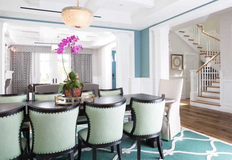
Interior Design Trends for 2016
Every year has its own interior design trends, and 2016 is shaping up to be no exception. Below are our top 3 picks to inspire you as we head into Spring!
MIXED METALS
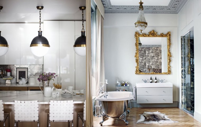
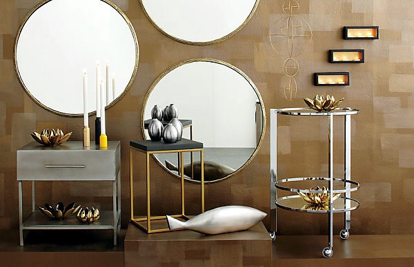
Gold and silver can be friends in our book. Platinum, gold, copper, steel, rose gold, brushed bronze – as long as they’ve got metallic sheen, they can work together. Dip your toe in with mixing frame colors on a gallery wall. Or separate through height, cluster silver items in one area and gold in another. Or go for the big bling: in an already dramatic room – bold items just add more to the mix.
BRING THE OUTSIDE IN
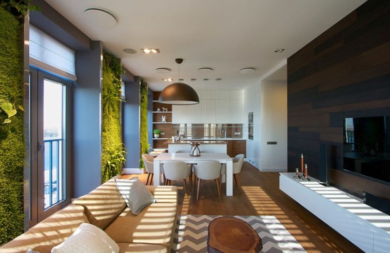
Bringing nature closer to your home is beautiful, calming, and healthy, too. Projects for this year are filled with natural elements like cork, wood, stone, and raw concrete. Plants are everywhere, from small table-gardens, to living walls, to groupings of small pots on a side table. And don’t worry – if you have less than a green thumb faux greenery has come a long way. Also, think about the relaxed use of outdoor furniture indoors – like rattan – or indoor furniture outdoors.
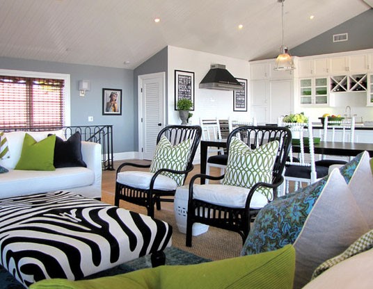
Source: http://www.houzz.com/photos/query/rattan-chair/nqrweh
BOLD BLUES
Indigo shades such as cobalt, navy and royal blue are the hues to use for the upcoming year. These colors are versatile and can be used in most areas: living, kitchen, dining room, bedrooms, and outdoors. Consider a new coat of navy to bring drama to your living room. But you don’t need to go all out, adding a pop of blue as an accent piece is a great way to stay current without a major commitment. Or you can be brave and paint walls, crown, and base board all the same hue for a monochromatic, high impact look.
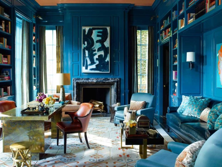
Source: http://curioelectro.com/interior-design-as-web-design-inspiration
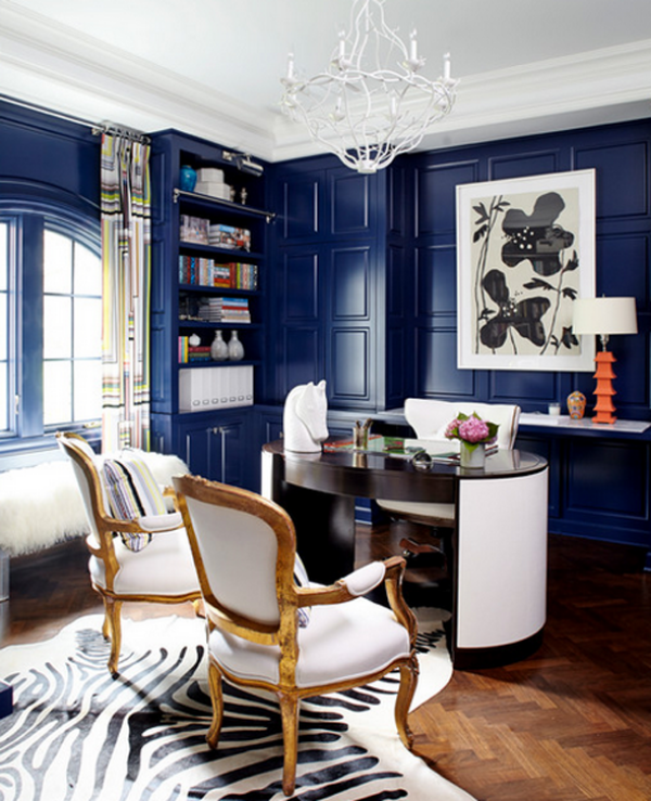
Source: http://www.houzz.com/photos/5941065/Harding-Family-Home-eclectic-home-office-other-metro
Fashion and Furniture: The Uniformed Cycles
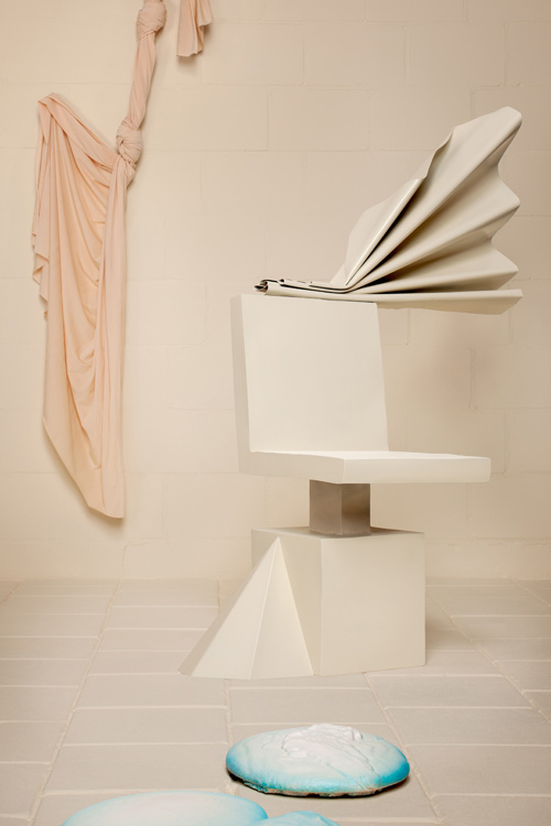
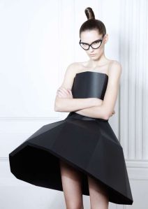
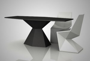
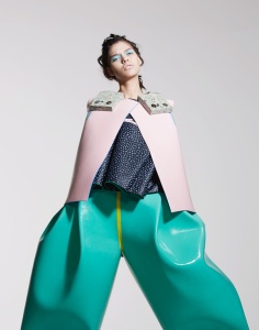
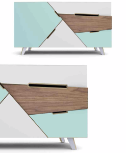
Fashion and furniture go hand in hand through cycles, through seasons, through explorations. They carry similar patterns and colors and move together through the motion of new design discovery in unison. If you look closely at both worlds (fashion and furniture) you can see that they are both sculptures, both art, both work closely with the human body. Below are some sculptural examples, scroll down and mesmerize yourself with this beauty.
Finding both of these amazing works of art on PINTEREST, notice how great artists think a like and develop similar shapes and colors for both fashion and furniture.
Another example of sculptural art in both innovative industries. The beautiful use of color and shape to create these pieces that develop strong visual interest. These images again are from the powerful source of PINTEREST.
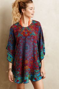
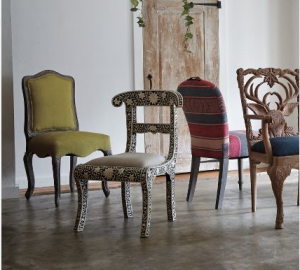
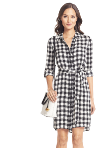
Outside of the sculptural side of these industries there is also an everyday side that focuses mostly on pattern and fabric. Anthropologie, Dot and Bo for furniture have similar color schemes and pattern as Diane Von Furstenberg, a great artist that uses color and pattern to express herself. Lets take a look to see how they follow similar identities.
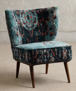
These works of art are both from Anthropologie, following similar color and patterns and are expressing the season between winter and spring. The bright reds shining from the beautiful cool blues.
Notice here, with Diane Von Furstenberg, her use of pattern and color contrast emanate through these unique and stunning chairs from Anthropolgie’s home selection.
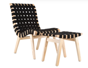
DVF vs Dot and Bo’s checkered chair and ottoman. The look, the feel, the ideas are so similar. They both carry the look of comfort as well, treating the body with similar respect.
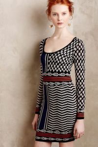
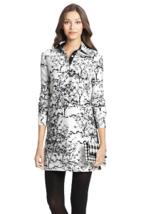
Pattern and color once again, this time between Diane and Anthropologie. Notice how those qualities are not the only ones that shine through these beautiful designs, but the shape. They both have square or rectangular characteristics for their body which work really well together.
Once again, fashion and furniture hold hands through seasonal change, along with pattern and color explorations. A stunning thing to see multiple industries working together to create balance in the design world!
